What Color of Blinds Should I Choose for My Living Room?
Could the wrong blind color be ruining your living room’s vibe? It might seem like a small detail, but the color of your blinds can dramatically affect the look and feel of your space. Blind color is instrumental in setting a room’s mood and enhancing its aesthetic. What color of blinds should i choose for my living room? Let’s explore with in-depth research.
Choosing the Right Blind for Your Living Room
Choosing the right hue for your living room blinds isn’t just about matching the decor; it influences the ambiance, perceived size, light levels, and even the energy efficiency of the room.
In this guide, we’ll provide expert advice on selecting the perfect blind color based on your interior design style, lighting, desired mood, coordination with furniture, and practical needs. By the end, you’ll know what color blinds will make your living room feel just right.
Interior Design Style Matters
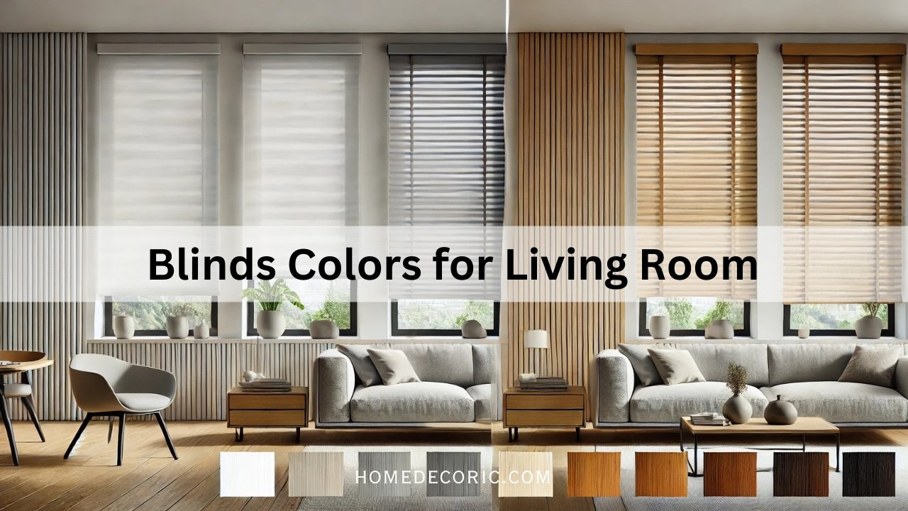
Your interior design style greatly influences what blind colors will work best. A modern minimalist space might call for different blinds than a boho-chic living room. The key is to pick blinds that complement your décor’s theme and color palette. For example, contemporary styles often stick to simple neutral blinds that blend in smoothly, whereas traditional designs might embrace richer tones or wooden blinds to match their classic, elegant vibe. Consider the style of your living room and use that as a starting point:
- Modern / Contemporary: Emphasize clean lines and simplicity. Neutrals like white, off-white, gray, or black blinds work well to maintain a sleek look. These colors won’t distract from modern furniture and typically match contemporary color schemes. (Modern designs often favor neutral palettes with occasional bold accents.
- Classic / Traditional: Traditional rooms with classic furniture and rich colors can handle blinds in warm neutrals (cream, taupe) or deep tones. Wood blinds stained to match furniture or Roman shades in luxurious fabrics and rich hues can add elegance without clashing. For example, a mahogany wood blind can echo other wooden elements in a classic living room.
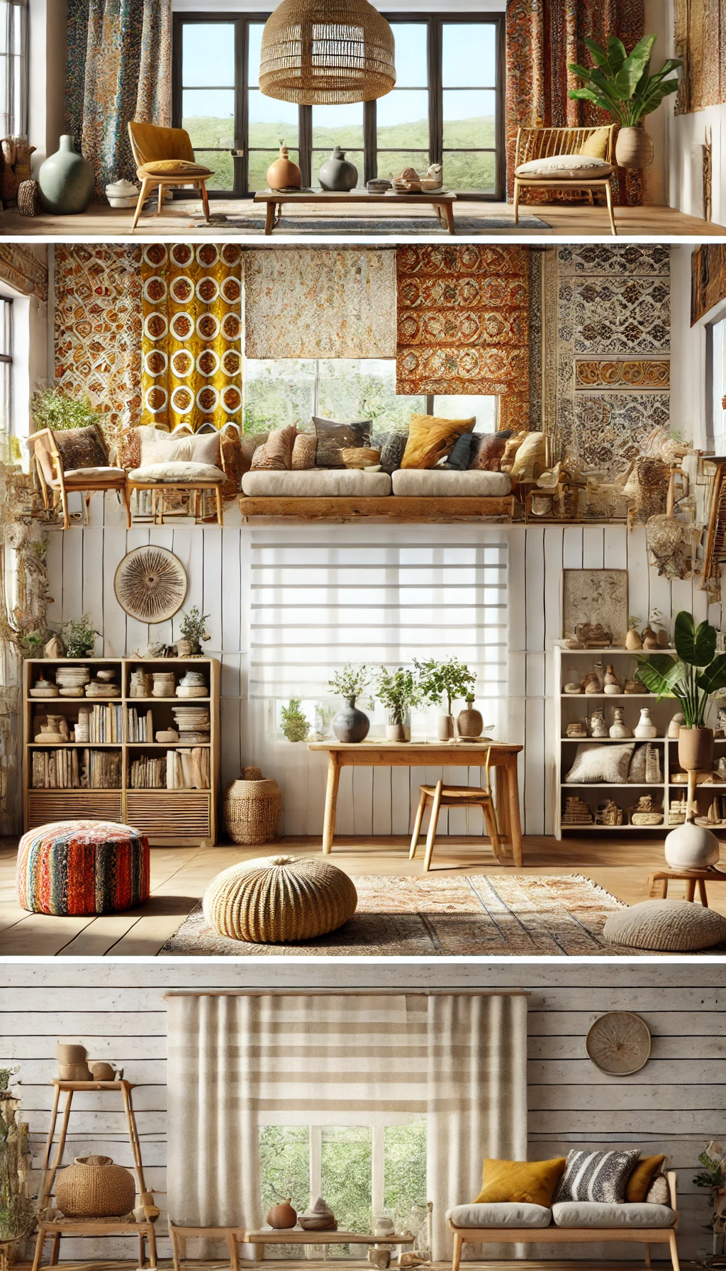
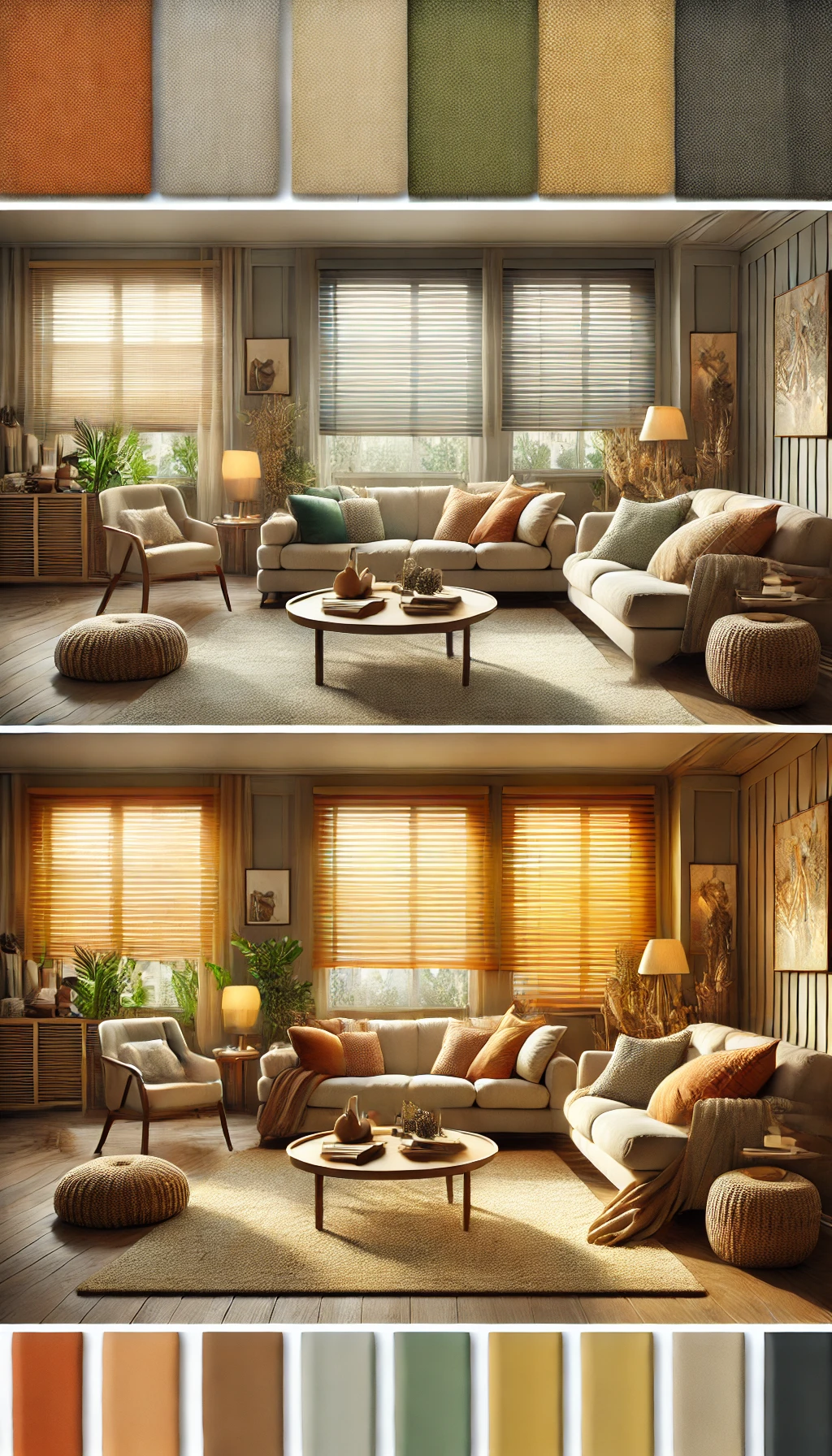
- Bohemian / Eclectic: Boho and eclectic styles love color and pattern. Don’t be afraid to choose blinds in bold earthy tones (mustard yellow, terracotta) or vibrant colors pulled from your décor. Patterned fabric blinds or woven bamboo shades can also fit a bohemian look. The blinds can act as an art piece, but at least one hue ties into other textiles in the room to keep it harmonious.
- Scandinavian / Minimalist: These styles favor a light, airy feel. White or light gray blinds are popular to maximize brightness and blend with the pared-back design. In Scandinavian design, pale wood blinds or beige and gray tones maintain the calm, hygge vibe. The idea is to keep window treatments low-key so the space feels open and uncluttered.
- Rustic / Farmhouse: Embrace natural tones. Wood or faux-wood blinds in oak, walnut, or white-wash finish complement rustic furniture and shiplap or farmhouse trim. Earthy greens or barn red could work as accent colors if they echo other elements in the room, but neutral, earthy colors will pull together a cozy farmhouse look.
Consider the Room’s Lighting (Natural vs. Artificial)
How much light your living room gets – and the type of light – should influence your blind color choice. Colors can look very different in bright daylight versus lamplight at night. Here’s how to factor in lighting:
- Rooms with Abundant Natural Light: If your living room has large windows or faces the sun, think about how the sun will interact with your blinds. Bright sunlight can wash out pale colors, making rich or dark-colored blinds stand out. Light-colored blinds (white, ivory, light gray) will reflect sunlight and keep the room bright, whereas dark blinds will absorb light and create a stronger contrast. Also, prolonged direct sun can cause some colors (incredibly bold or dark) to fade over time. If you love a deep color but have intense sun, look for UV-resistant materials to preserve the hue.
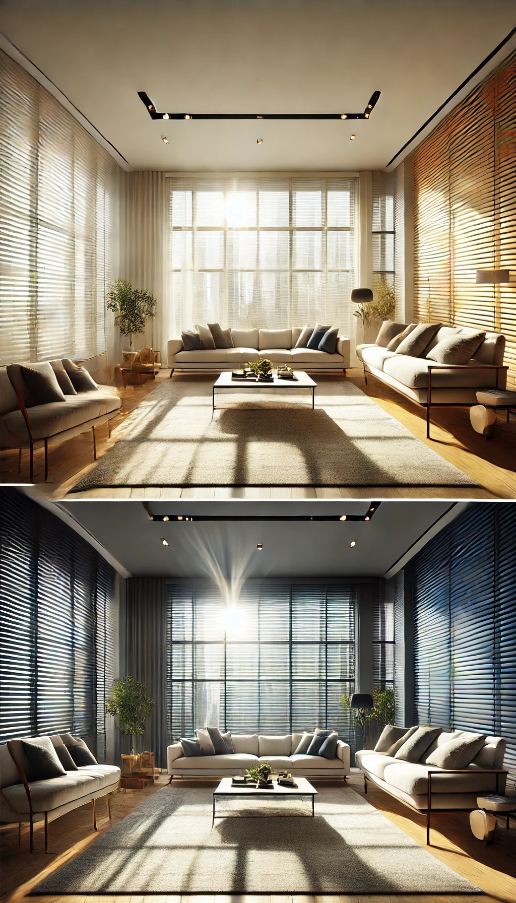
- Rooms with Low Natural Light: Lighter-colored blinds are generally a smart choice if your living room is on the darker side (north-facing or small windows). Choosing a light color can make a dim room feel brighter and more open by reflecting whatever light is available. In a naturally dark room, dark blinds make it feel cave-like. So unless you deliberately want a moody, cozy den, err on the side of a pale neutral that helps amplify light.
- Artificial Lighting Considerations: Pay attention to the color of your light bulbs (warm yellow vs. cool white) because they will tint how your blinds appear at night. A cool-toned gray blind might look blue under warm incandescent lamps, for example. It’s wise to get sample swatches of a blind color and view them in your living room at different times of day.
Experts note that colors can look very different in person under various lighting conditions. Test how the blind color works with daytime sun and your evening lamps to ensure you’re happy with it in all lighting. Also, consider glare: if you often watch TV during the day, a bright white blind could cause glare; a slightly darker or matte-textured blind might be preferable to soften the light.
Mood and Ambiance: Warm vs. Cool Tones
Think about the mood you want in your living room. Do you want it to feel cozy and energizing or calm and relaxing? The color tone of your blinds can support that goal:
- Warm Colors for a Cozy, Inviting Vibe: Warm-toned blinds include hues like creams, taupes, yellows, oranges, reds, or warm wood tones. Warm colors make a space feel welcoming and intimate. They literally “warm up” the mood of a room, often evoking comfort and energy. In a living room – the social heart of the home – using warm neutrals or soft, earthy colors can be great for encouraging a comfy, friendly atmosphere. For instance, earthy beige, soft gray, or muted green blinds can create a harmonious and comfortable environment in living rooms. These kinds of colors enhance the feeling of warmth and togetherness, perfect for family gatherings. If you want a burst of cheerfulness, some designers even incorporate brighter, warm hues (like a golden yellow or terracotta blind) as an accent to add personality – use bold colors sparingly so they don’t overwhelm you.
- Cool Colors for a Tranquil, Airy Feel: Cool-toned blinds include colors like blues, greens, purples, or cool grays. Cool tones generally bring a sense of calm and relaxation. While living rooms are often lively, you may use yours for quiet relaxation and want a peaceful vibe. Fabulous neutral blinds (such as silvery gray, slate blue, and sage green) can impart a soothing atmosphere. Remember that intense cool colors (like deep blue) can sometimes make a room feel a bit cooler in mood and literally in light (blue filters light differently), so balance them with some warm elements in the decor if you want to avoid a space feeling too chilly.
- Neutral Tones for Flexibility: Don’t forget that neutral-colored blinds (white, off-white, beige, gray) are a popular choice for a reason. They provide a balanced backdrop that can adapt to almost any style or season. Neutrals neither overstimulate nor dull the senses – they often create a calm, orderly feel and won’t go out of style quickly. For living rooms, neutral blinds are a safe bet if you anticipate changing your wall colors or furniture over time or want the freedom to redecorate accents without replacing the blinds. They also help a small room feel less cluttered. Just be careful: exclusively using very bland neutrals everywhere can make a space lifeless, so ensure there’s some contrast or texture in your living room for interest (for example, white blinds in a room with white walls might need colorful art or pillows elsewhere to avoid a stark look).
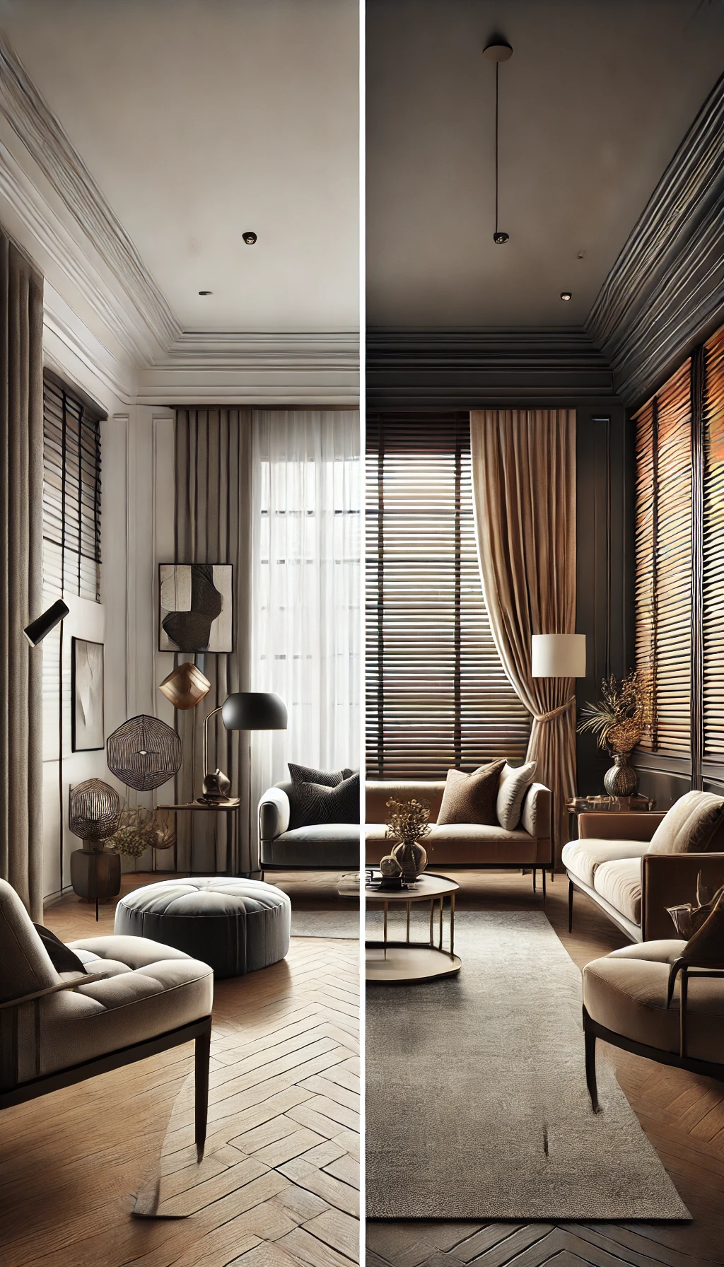
- Impact on Perceived Space: Color also affects how spacious or cozy your room feels. Lighter colors are visually expansive – light blinds can make a small living room feel brighter and larger. If you’re trying to open up a cramped space, pale blinds that blend with the wall can do the trick. On the other hand, darker colors add depth and can make a significant, impersonal room feel more snug. In a big living room with many windows, darker blinds (charcoal, navy, dark wood) can add depth and coziness, especially in the evenings when they’re closed. Just remember that dark blinds on large windows will be a prominent feature when drawn, so be sure you love the color and that it complements your furnishings (dark blinds can become an accent piece of their own).
Matching Blinds with Furniture & Decor
For a genuinely pulled-together living room, coordinate your blinds with the room’s existing color scheme and decor elements. There are two main strategies here: blend in or stand out:
- Blending In (Matching Colors): If you want your blinds to disappear into the decor, match or closely coordinate their color with something already in the room. A typical designer approach is to match the blind color to the wall or trim color for a seamless look. For instance, if your walls are soft gray, gray blinds in a similar shade will blend in with the tone-on-tone, creating a cohesive, sophisticated feel. This tone-on-tone look is very in style right now. Matching the window trim is another safe tactic – many trims are white, so white blinds will automatically tie in and not clash with other decor. Blending colors is excellent when you want different features (like furniture, art, or a view outside) to be the star of the room and the blinds to provide a neutral backdrop.
It’s a classic, timeless choice that’s unlikely to date. Just keep in mind that even neutrals have undertones (some whites are cooler or warmer, so try to match the tone of your blinds to the room (e.g., if your walls are a warm cream, go for an off-white or ivory blind rather than stark snow white).
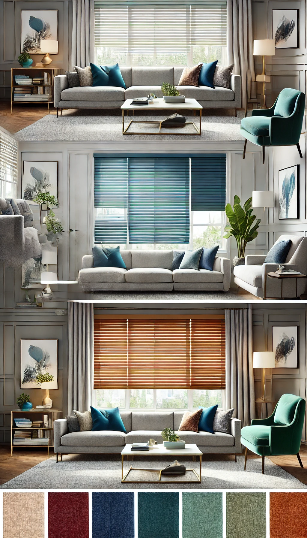
- Standing Out (Contrasting Colors): On the flip side, blinds can also serve as an accent or focal point by contrasting your walls and furniture. If your living room walls and furniture are mostly neutral or subdued, a pop of color on the windows can add visual interest. For example, in an all-white room, a bold-colored blind makes a statement and ties the room together. Dark blinds against light walls (black blinds on white walls, navy on light gray) create a modern, dramatic contrast. Bright blinds against neutral walls (like a burst of teal or red in an otherwise beige room) can introduce a fun personality. This approach works exceptionally well in eclectic or contemporary designs that welcome a bit of drama.
Contrast draws the eye, so use it deliberately: if your sofa or rug has an accent color, you could echo that in the blinds for cohesion. Just avoid clashing colors – the blinds should still complement other elements. A good rule is to pick a blind color that appears elsewhere in the room’s décor (maybe in a throw pillow pattern or artwork) so it feels integrated. If you go with a patterned blind, ensure at least one of the pattern’s colors matches your room’s palette.
Whether you blend or contrast, take a holistic view of the room. Look at your furniture upholstery, rugs, artwork, and accessories – do your blinds pick up one of the existing colors or provide a pleasing contrast? For instance, if you have a navy blue armchair as a bold piece, creamy off-white blinds might balance it better than navy blinds (which could be overkill).
Conversely, if most of your décor is neutral but you have a patterned rug with hints of green, a soft green blind could pull that color onto the walls nicely. Some experts suggest matching your blinds to an existing fabric color in the room for foolproof coordination. Ultimately, let your blinds either complement or intentionally accent your design. Step back and imagine the open and closed blinds – you’ll see a lot of that color when they’re drawn down, so it should make the room feel inviting.
Practical Considerations (Cleaning, Maintenance & Light Control)
Beyond style, think about the practical implications of your blind color choice. Different colors can have advantages or drawbacks when it comes to upkeep and functionality:
- Showing Dust and Dirt: All blinds gather dust over time, but color influences how visible that dust is. White blinds, while crisp and clean, can show dust and dirt relatively quickly – the dust can appear as a gray film if not cleaned regularly. You might notice the buildup sooner on a white slat in bright sunlight. On the other hand, very dark blinds (black, espresso brown) tend to highlight light-colored dust, too, and they can show lint or pet hair more.
Colors in the mid-range (grays, wood tones, creams) or those with textures/patterns are often the most forgiving for hiding dust. If ease of maintenance is a priority, consider blinds in off-white, beige, or wood tones that won’t starkly reveal every speck. Of course, the solution for any color is regular cleaning – a quick dusting or vacuum with a brush attachment will keep them looking fresh. Also, be mindful of stains: in a living room that opens to a kitchen or where people might touch the blinds often, very light colors might pick up fingerprints or discoloration over time.
- Fading and Longevity: Sunlight can fade fabrics and paints, and blinds are no exception. Darker and more vibrant colors show the sun fading more than lighter ones. For instance, deep red or navy blinds might slowly lose vibrancy on the side facing the sun or develop a slight bleach effect over the years. If your living room gets strong sun and you’re eyeing a bold color, ensure the product is UV-resistant or be prepared that you might need to replace them after some years if fading occurs.
Lighter colors like white, gray, or beige are less prone to apparent fading and discoloration (they can fade, too, but are less noticeable). Quality matters here: high-quality blinds with UV inhibitors will maintain their color longer. If you live in a very sunny climate, sticking with lighter neutrals or investing in suitable quality materials for darker blinds might be practical.
- Light Control & Privacy: The color of your blinds isn’t just aesthetic – it can subtly affect lighting performance. Lighter-colored blinds reflect more light, which helps keep the room bright when the blinds are closed or tilted, but they may let more glow through and not darken the room as much. Darker-colored blinds block light more and reduce glare by absorbing light. If you enjoy soft natural light filtering through, pale blinds will create a gentle glow. But if you watch TV in the living room or have glare on screens, a slightly darker blind or one with a blackout lining might be beneficial.
Also, for privacy at night, dark blinds obscure shapes and shadows better when lights are on inside. Consider your living room’s function: is it a bright gathering spot or a media room/guest sleep space? You might choose a color that supports that (e.g., a medium-toned blind that dims the room nicely for movie night versus a very bright one that might require additional curtains to block light entirely).
- Energy Efficiency: Here’s a bonus insight – blind color can influence your room’s temperature. Light-colored blinds reflect sunlight and help keep a room cooler, which is great in summer or warm climates. Dark blinds will absorb more solar heat, potentially warming the room (which could be a perk in winter or cooler climates). If your living room gets hot afternoon sun and you want to reduce heat, choosing blinds in a light color (and a reflective material if possible) can assist in deflecting some heat.
Conversely, darker blinds might slightly help soak up heat in a chilly room during the day. While the insulation effect of color is not huge compared to the blind material or added liners, it’s something to consider if climate comfort is a big concern.
- Durability of Color Trend: Consider how the color will age in style. Neutrals are timeless and buyer-friendly (if you plan to sell your home, neutral window treatments are generally a plus). Very trendy colors might look dated in a few years, so be sure you truly love a bold choice if you go that route. The good news is blinds can be changed without too much fuss, but ideally, you want to enjoy them for a while. Think of the overall longevity: will you still love that bright teal blind in five years, or would a gray blind with teal curtains (that can be swapped out) be safer? It’s all about balance between personal flair and long-term satisfaction.
By weighing these practical factors alongside style preferences, you can choose a blind color that looks amazing and serves your day-to-day needs. The goal is a living room that feels right in appearance and function, where the blinds’ color contributes to your comfort, convenience, and enjoyment of the space.
FAQs
Q1: Should my living room blinds match the wall color?
Not necessarily – it depends on the look you’re going for. Matching the wall color (or trim) is a fail-safe way to get a seamless, understated look. For example, white blinds on white walls create a clean, unified appearance where the blinds blend in as part of the architecture. This can make a room feel larger and is a popular, modern approach (tone-on-tone matching is very on-trend. On the other hand, contrasting your blind color with the walls can add character and make the windows a focal point. A light wall with dark blinds (or vice versa) contrasts stylishly.
There’s no strict rule: if you want a calm, cohesive vibe, match the walls; if you want a bit of “pop” or drama, choose a different color that complements your decor. Just ensure whatever you choose doesn’t clash with other elements in the room. Sometimes, homeowners go a few shades lighter or darker than the wall to create gentle contrast without straying from the overall color family – this adds interest while still feeling coordinated.
Q2: Can I use different colored blinds in other rooms of my house?
Absolutely. You do not have to use the same blind color throughout the house. While using one color everywhere can create a uniform, cohesive look (which can be nice for an open-plan layout or curb appeal outside), it’s perfectly fine to mix and match blind colors by room to suit each space’s décor. Each room can have its personality – for instance, you might have calming gray blinds in the living room but fun blue blinds in a child’s bedroom. Many designers recommend tailoring window treatments to each room’s style and function. The advantage of same-color blinds in every room is a consistent look (from the house’s exterior, it all matches).
However, the benefit of using different colors is that you can best complement each room’s color scheme and mood. A good compromise: keep a common element for unity, such as using the same blind style throughout (e.g., all roller shades or all wood blinds), but vary the colors to fit each room. Also, suppose you’re concerned about the view from outside. In that case, many blinds have a neutral white backing facing the street, so you can enjoy different colors inside without affecting exterior uniformity. In short, do what looks best for each room – there’s no one-size-fits-all rule.
Q3: What color blinds will make a small living room look bigger?
Light colors are your best friend when making a small living room appear larger and more open. Blinds in white, off-white, cream, or light shades of gray/beige will reflect light and visually recede, which expands the sense of space. Light-colored blinds can make a room feel brighter and bigger. They blend with lightly colored walls to create an unbroken line, so your eye isn’t stopping at the window frames. In contrast, dark blinds on a small room’s windows can create a heavy, framed effect that might make the space feel more cramped or make the windows seem smaller. That said, if you have light walls and choose blinds to match, you achieve a continuous, airy look. Another tip: mount blinds high and wide (if possible) so they don’t block the window when they’re open – this lets in maximum light and makes the window and room feel larger. But color-wise, stick to pale or neutral tones in a small living room for an expansive effect.
Q4: Will dark blinds make my living room too dark or hot?
Dark-colored blinds will undoubtedly have a different effect than light ones, but whether they make the room “too dark or hot” depends on your situation and preferences. In terms of light, dark blinds (like charcoal, navy, or espresso) will block out more sunlight when closed compared to white or light blinds. They tend to darken a room more because they absorb light rather than reflect it. If your living room already doesn’t get much natural light, very dark blinds might make it feel dimmer unless you open them fully. However, if you have an abundance of sunlight and want to reduce glare (for example, during TV time), dark blinds can be helpful. You can also choose a dark color in a light-filtering fabric, so it’s dark but still lets some light through for a happy medium. In terms of heat, dark blinds can absorb solar energy and may warm up the space when the sun hits them.
This can be a downside in a hot climate or summer, as the room could get warmer, acting like a heat absorber. Conversely, retaining warmth in cold temperatures or winter could be a slight advantage. If overheating is a concern but you want dark blinds, look for ones with a thermal or reflective lining (often white or metallic on the window-facing side) that can keep heat out. Also, when dark blinds are open (rolled up or pulled to the side), their color doesn’t matter – the room will be as bright as your windows allow. Only when they’re closed does the color affect light and heat. Many homeowners successfully use dark blinds in living rooms for a dramatic look; pair them with lighter walls or plenty of lighting so the room doesn’t feel gloomy when the blinds are drawn.
Q5: What blind colors are most popular or in style right now?
The perennial favorite for blind color is neutral tones. The most popular blind colors are neutral shades like white, off-white, beige, and light gray. These colors are timeless and versatile and work with virtually any interior style, so they’re a go-to choice for many living rooms. Neutrals, especially in light hues, also align with the ongoing trend of airy, light-filled spaces (think modern, Scandinavian, and farmhouse styles where whites and grays dominate.
That said, we’re also seeing some bolder choices as accents: deep navy or charcoal gray blinds have become popular in modern homes to contrast white walls. Nature-inspired colors are in style, too, as homeowners bring in greens (sage, olive) or blues (dusty blue, teal) to add character while keeping a soothing vibe. Wooden blinds and wood tones (bamboo, oak, walnut finishes) are also popular – the natural texture and color add warmth and act like a neutral in many cases. You can’t go wrong with neutral blinds in whites or grays for a stylish look that endures.