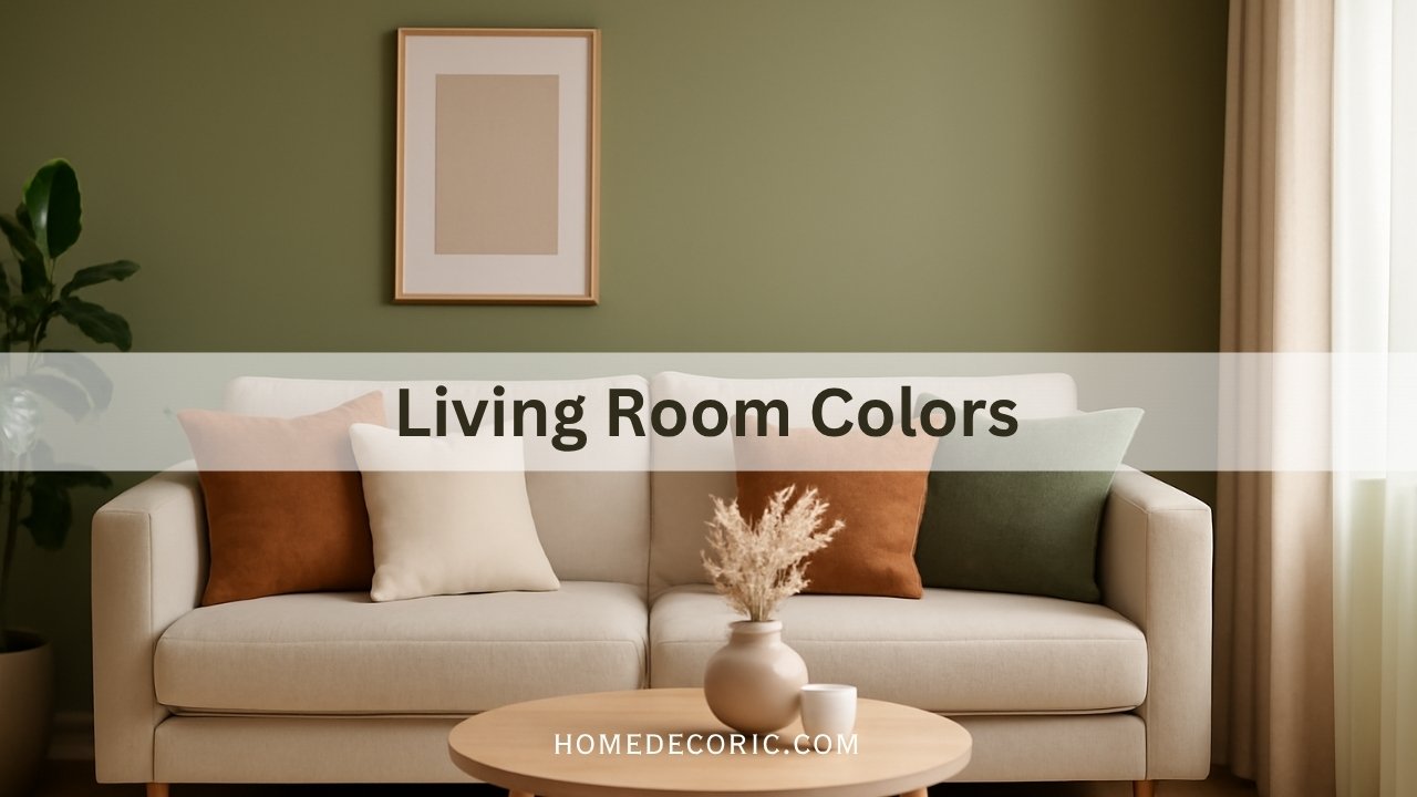
Which Color Is Best for a Living Room?
Have you ever walked into a living room and instantly felt relaxed, energized, or inspired by the color on the walls?
I am sure color isn’t just paint; it’s personality. It sets the tone for how you feel in your home, how you host guests, and even how you unwind after a long day.
So, which color is truly the best for your living room? The answer depends on your lifestyle, the natural light in your space, and the atmosphere you want to create.
Let’s explore which colors, from calm neutrals to bold statement shades, can transform your living room into a warm and welcoming retreat.
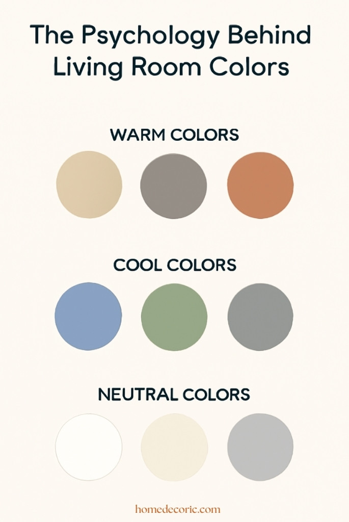
The Psychology Behind Living Room Colors
Did you know that colors have psychological effects that can influence mood and perception? Choosing the right hue for your living room goes beyond aesthetics; it’s about creating emotional harmony.
- Warm colors like beige, taupe, and terracotta create comfort and intimacy. They make larger rooms feel cozy and inviting, perfect for family gatherings or movie nights.
- Cool colors like blue, green, and gray evoke calmness, peace, and relaxation. These shades are ideal for people who want a stress-free, spa-like atmosphere at home.
- Neutral colors, such as white, cream, and soft gray, are timeless and versatile. They provide a blank canvas on which furniture, art, and textures can shine.
Understanding the psychology of color helps you design intentionally, not just decoratively. For example, blue can lower stress levels, green symbolizes growth and harmony, and warm shades like terracotta stimulate warmth and connection.
Top 7 Best Colors for Living Rooms in 2025
I will share the most popular and designer-approved living room colors 2025, each chosen for its emotional effect, versatility, and compatibility with modern interiors.
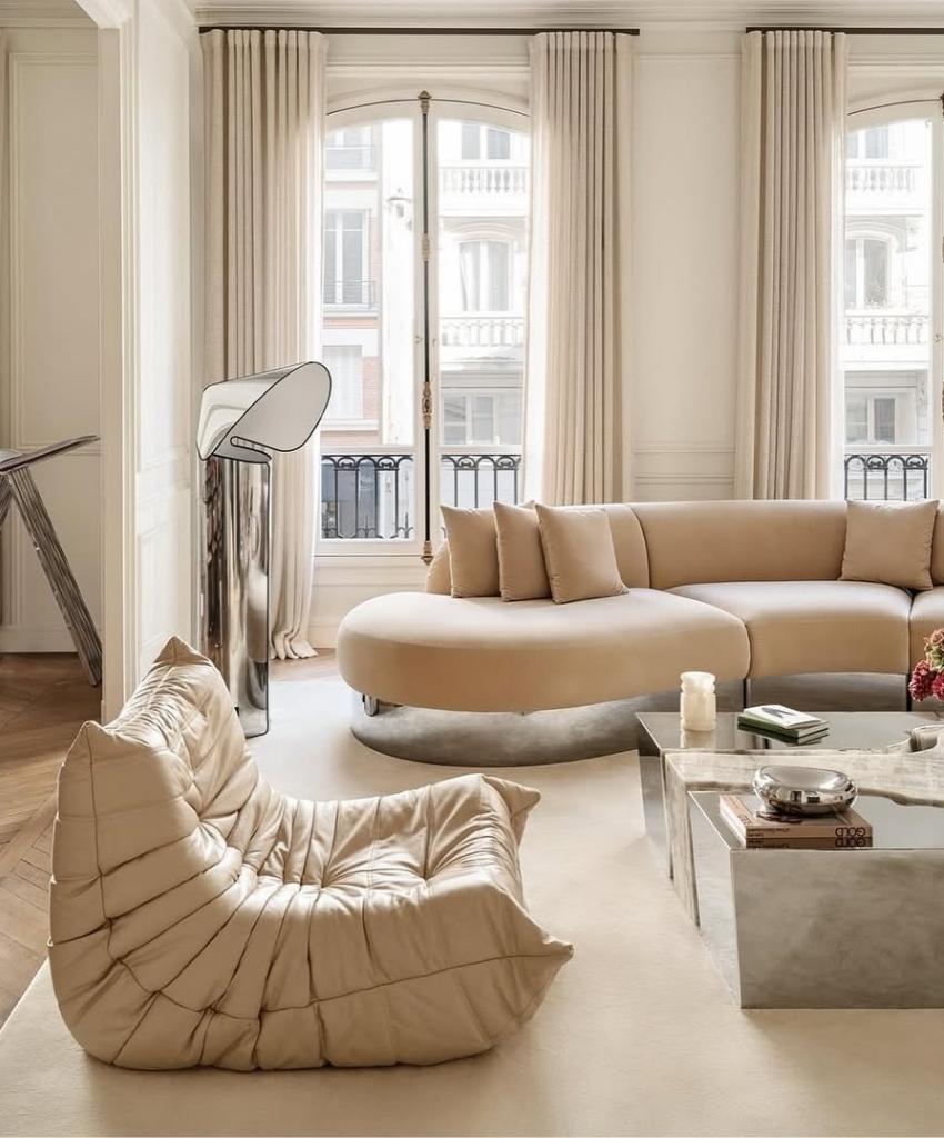
1. Soft Beige – The Timeless Classic
Soft beige never goes out of style. It’s the color of calm, sophistication, and balance. Unlike stark white, beige offers a warm undertone that flatters every type of décor, whether minimalist, vintage, or farmhouse.
It also pairs beautifully with wooden furniture, black metal accents, or gold details, creating a cozy yet refined look.
Why it works: Beige reflects natural light without being too bright, helping your room feel spacious and balanced.
Best For: Homeowners who want an effortlessly elegant and welcoming space.
 credit: foromshop
2. Sage Green – The Nature Lover’s Choice
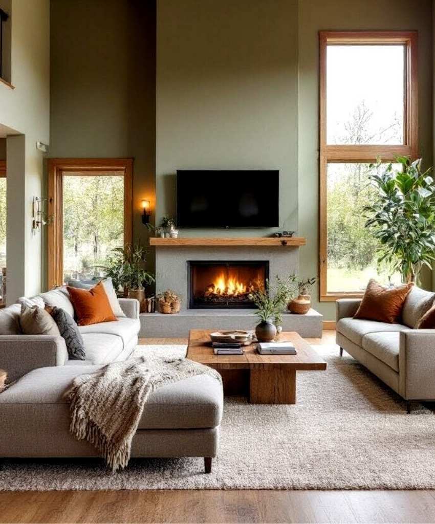
Sage green has become a modern favorite in interior design. Inspired by nature, it brings a refreshing and grounding feel to any space. This muted tone adds serenity while still being colorful enough to make a statement.
Why it works: Sage complements natural textures like rattan, jute, and linen. It creates a seamless indoor-outdoor connection perfect for eco-conscious and plant-filled homes.
Best For: Boho, modern organic, or minimalist interiors where balance and tranquility matter most.
 credit: homedesignsai
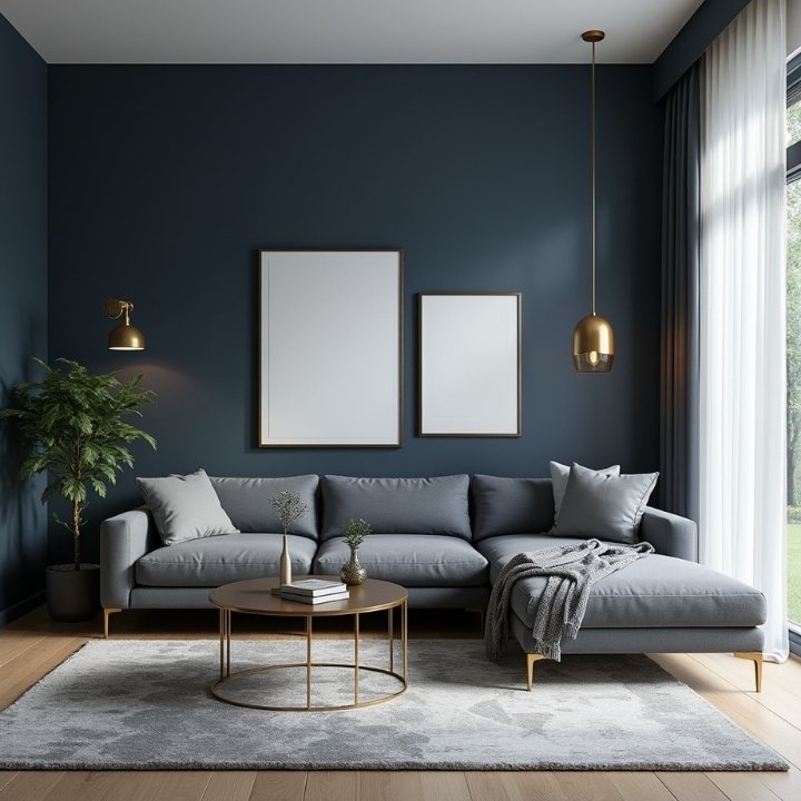
3. Navy Blue – Sophisticated & Modern
Navy blue exudes luxury and confidence. It’s bold but elegant, and when paired with gold or white accents, it gives your living room a five-star hotel vibe.
Why it works: The Navy’s deep tone creates visual depth and coziness. It absorbs light, making it great for large or well-lit spaces.
Style Tip: Use navy on a feature wall behind your sofa or TV to create contrast without overwhelming the space.
Best For: Contemporary, industrial, or coastal interiors that aim for bold sophistication.
 credit: alwahaestates
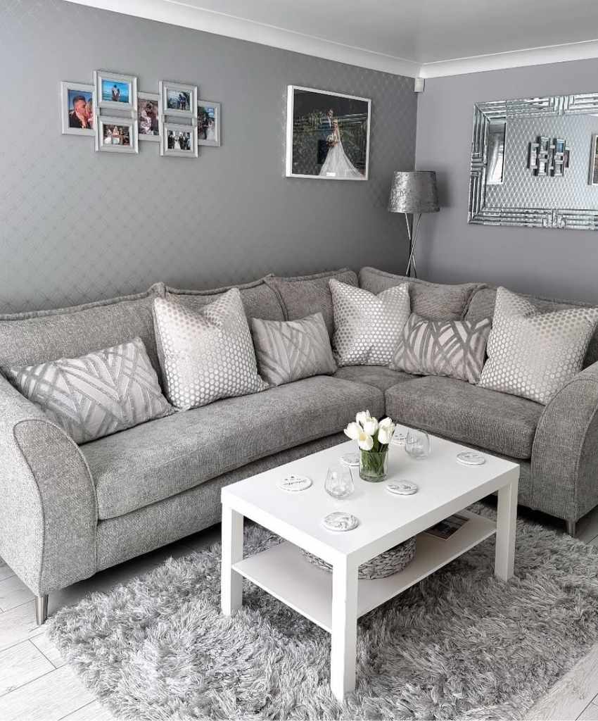
4. Light Gray – Chic and Versatile
If flexibility is your goal, light gray is unbeatable. It sits perfectly between warm and cool tones, allowing it to adapt to almost any furniture or décor theme.
Why it works: Light gray adds modern simplicity and pairs effortlessly with pastel pinks, bold blacks, or metallics. You can create depth by layering various textures, such as wool rugs, velvet cushions, and matte décor.
Best For: Scandinavian and minimalist homes that value simplicity and elegance.
 credit: gemmaphillips_x
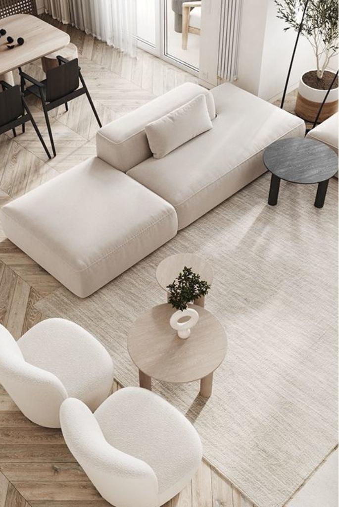
5. Cream White – Clean & Spacious Feel
Cream white brings in the magic of brightness and space. Unlike plain white, it has subtle warmth that prevents the room from feeling cold or sterile.
Why it works: It reflects sunlight beautifully and makes your room appear larger and airier, making it a perfect solution for apartments or smaller homes.
Design Tip: Add green plants or wood furniture to introduce contrast and life.
Best For: Minimalist and contemporary interiors that aim for serenity and balance.
 credit: mollaanbabbingtoncompass
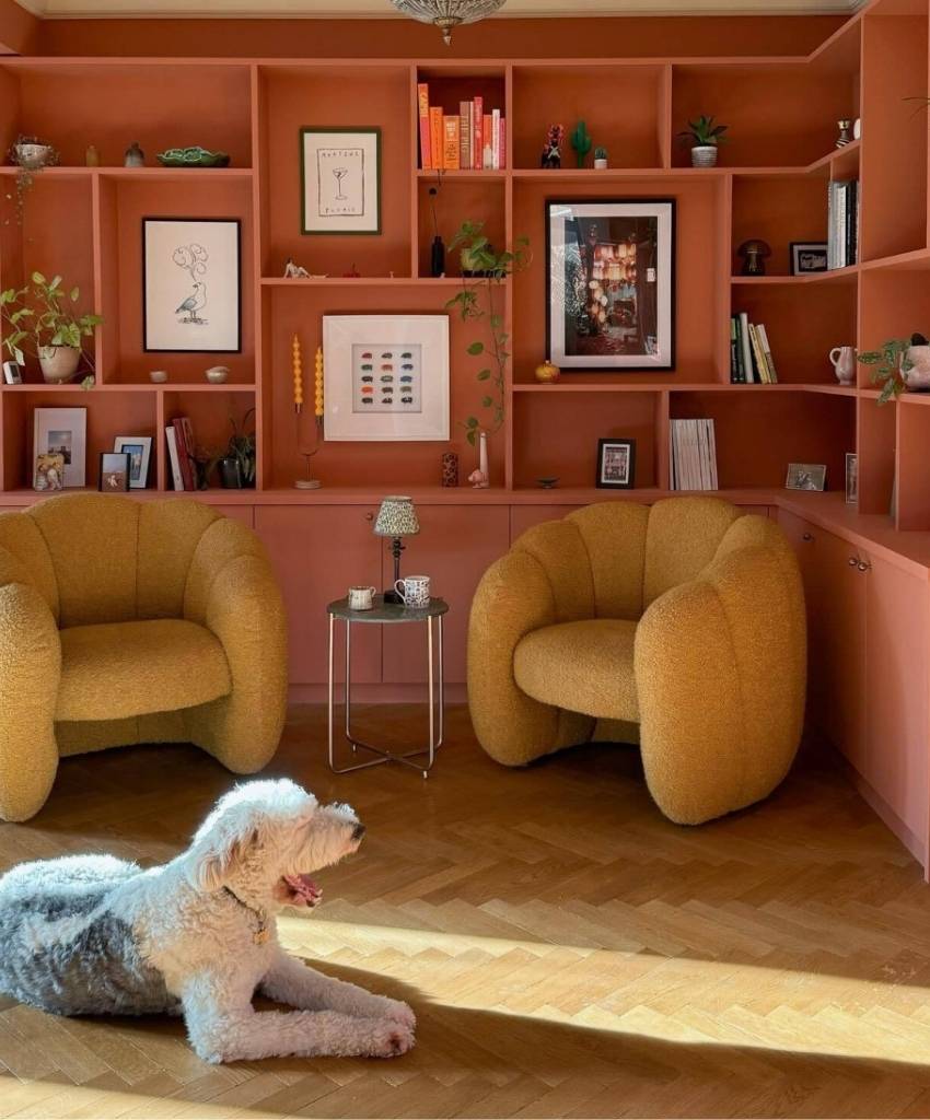
6. Terracotta – Warm and Earthy
Terracotta is making a significant comeback. Its rich, clay-like tone adds depth, passion, and personality. It brings rustic warmth into modern homes while reminding us of Mediterranean sunsets and cozy fireplaces.
Why it works: Terracotta pairs beautifully with warm wood tones, beige textiles, and brass accents. It’s particularly stunning under warm lighting, where its earthy richness truly glows.
Best For: Boho-chic, rustic, and traditional spaces craving warmth and charm.
 credit: farrowandball
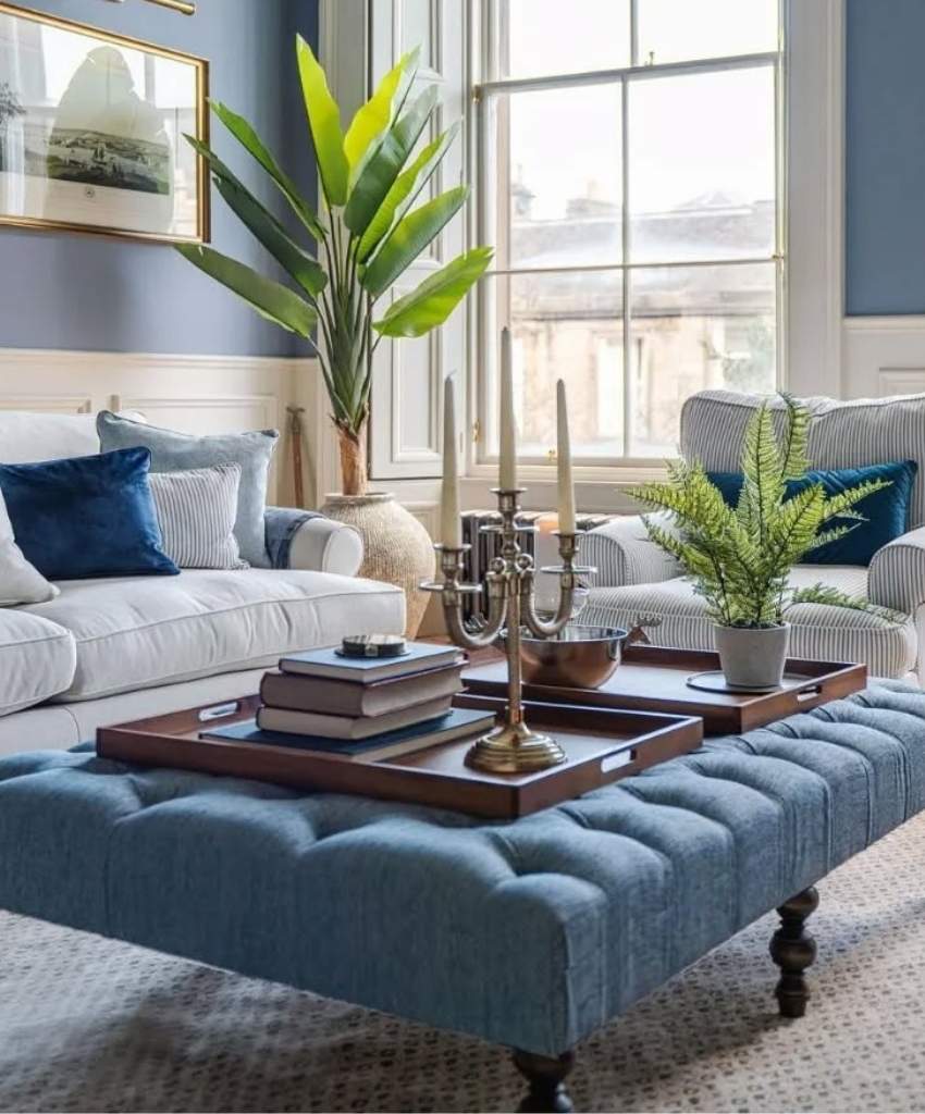
7. Dusty Blue – Calm and Coastal
Dusty blue is a soothing color that balances sophistication with comfort. It offers a more muted, elegant alternative to traditional sky blue, giving your living room a quiet elegance.
Why it works: It pairs beautifully with white trims, beige sofas, and natural fiber rugs, creating a room that feels both calm and coastal.
Best For: Seaside-inspired, transitional, or modern classic living rooms that embrace calm vibes.
 credit: myvictorianhouselove
How to Choose the Right Color for Your Living Room
Choosing a color isn’t about trends but your space, lighting, and personality. Here’s how to find the perfect shade:
1. Evaluate Room Size and Layout
-
- Smaller rooms benefit from light tones like cream, beige, or pastel hues, which make them feel open.
- Larger rooms can handle darker tones like navy or terracotta for a cozy, intimate vibe.
2. Observe the Lighting
-
- Rooms with south-facing windows get plenty of natural light, allowing bold colors to shine.
- North-facing rooms tend to feel cooler; use warm shades to balance them.
3. Coordinate with Furniture and Flooring
-
- Match undertones. If your furniture has warm wood, opt for warm paint shades. If your décor leans modern with chrome and glass, cooler tones like gray or blue fit better.
4. Test Before You Paint
Always apply paint samples on your wall and observe them throughout the day under different lighting. The color’s tone can shift dramatically between daylight and artificial light.
5. Reflect Your Personality
Your living room should express you. Love nature? Go for sage green. Prefer a clean, elegant aesthetic? Cream or light gray will suit you best.
Final Verdict
While every color has magic, Sage Green stands out as 2025’s winner. It’s natural yet sophisticated, calming yet stylish, striking the perfect balance between color and comfort.
Sage green effortlessly adapts to various décor styles, whether modern minimalism or vintage rustic. Pair it with neutral furnishings, light wood, and plenty of plants to create a living room that feels both fresh and timeless.

