How to Choose the Right Bedroom Color Palette for Better Sleep
The color on your bedroom walls influences your nervous system every night, whether you realize it or not.
Research from the University of British Columbia and published studies in environmental psychology confirm that certain colors lower heart rate, reduce cortisol levels, and support the body’s transition into sleep, while others actively delay it.
Choosing the right bedroom color palette is one of the highest-return changes you can make to your sleep environment.
This guide covers which colors promote better sleep, which ones to avoid, how to build a complete palette from walls to bedding, and how to match your color choices to your specific sleep style.
Why Bedroom Color Affects Sleep Quality
Color is not just aesthetic. Your brain processes color through photoreceptors that directly influence circadian rhythm, melatonin production, and nervous system arousal.
Certain colors signal alertness and stimulation. Others signal safety and calm, which is the state your body needs to transition into deep sleep.
Research published in the journal Chronobiology International links exposure to high-saturation warm tones in the evening to delayed sleep onset and lighter sleep cycles.
Cooler, lower-saturation colors consistently support parasympathetic nervous system activity, the biological “rest and digest” state that precedes sleep.
The wrong colors, particularly high-saturation warm tones like bright red, vivid orange, or electric yellow, can keep cortisol levels elevated longer into the evening and push back the time it takes to fall asleep by 20 minutes or more, according to sleep environment studies cited by the Sleep Foundation.
What Are the Best Colors for a Sleep-Friendly Bedroom?
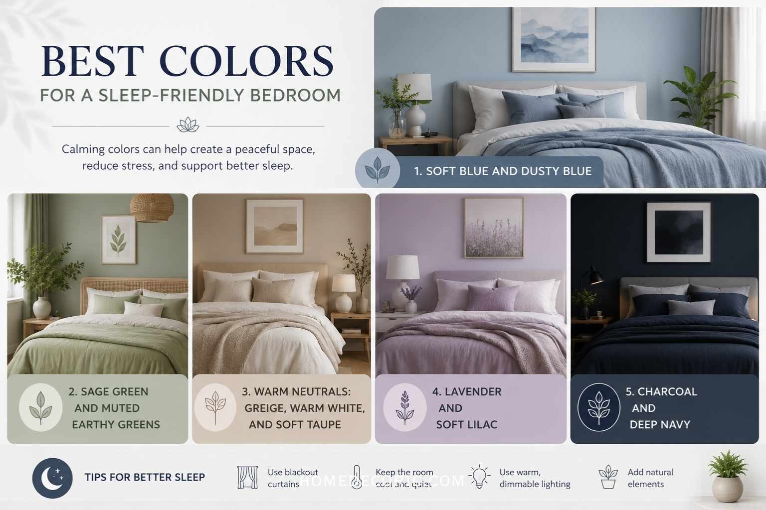
1. Soft Blue and Dusty Blue
Blue is consistently ranked the top sleep-promoting color in environmental psychology studies. Soft, desaturated blues create a sense of calm, openness, and temperature neutrality.
Best shades to try:
- Dusty blue (muted, grey-blue undertone)
- Slate blue (cool, sophisticated)
- Powder blue (light, airy, non-stimulating)
- French blue (deeper but still restful)
Why it works: Muted blue walls in dim evening light do not suppress melatonin the way blue-spectrum device light does. The psychological association with sky, water, and calm environments is what drives the sleep benefit.
Pairs well with: White trim, warm linen bedding, natural wood tones, soft grey accents.
2. Sage Green and Muted Earthy Greens
Green sits at the center of the visible light spectrum and requires the least visual adjustment from the eye, making it inherently restful. Sage, moss, and olive tones bring nature indoors, which, according to biophilic design research, reduces stress and lowers blood pressure.
Best shades to try:
- Sage green (grey-green, widely used in 2024-2026 bedroom design)
- Moss green (deeper, grounding)
- Celadon (soft, near-pastel green with warmth)
- Eucalyptus green (blue-green, fresh and calming)
Why it works: Nature exposure, even simulated through color and texture, activates restorative responses in the brain. A 2019 study in Building and Environment found that green-toned interiors were associated with lower reported stress and higher sleep satisfaction scores compared to white or grey rooms.
Pairs well with: Cream, warm white, terracotta accents, rattan, or natural wood furniture.
3. Warm Neutrals: Greige, Warm White, and Soft Taupe
Not every great sleep bedroom is cool-toned. Warm neutrals, when chosen carefully, create a cozy, enveloping environment that many people find deeply relaxing. The key is choosing tones with beige or pink undertones rather than yellow or orange.
Best shades to try:
- Greige (grey and beige blend, universally flattering)
- Warm white (cream or linen undertone, not stark white)
- Soft taupe (brown-grey, grounding and sophisticated)
- Blush beige (warm, romantic, still restful)
Why it works: Warm neutrals eliminate visual complexity without the coldness of stark white or grey. They use soft lighting to make a room feel enclosed and safe, reducing ambient anxiety.
Pairs well with: Textured fabrics, layered whites, terracotta, muted gold hardware, soft charcoal accents.
4. Lavender and Soft Lilac
Lavender is the most underused sleep color. Its association with the lavender plant, which has documented relaxing properties in aromatherapy research, gives it a psychological edge. Light purple tones at low saturation are peaceful and visually soft.
Best shades to try:
- Soft lavender (dusty, muted purple)
- Lilac (pink-purple, warm and airy)
- Wisteria (deeper lavender, elegant)
- Periwinkle (blue-purple crossover, calming and distinctive)
Why it works: Purple at low saturation carries cultural and psychological associations with rest and introspection. At high saturation, jewel-tone purples become stimulating. Keep it muted.
Pairs well with: Soft grey, warm white, blush pink, silver, or brushed nickel accents.
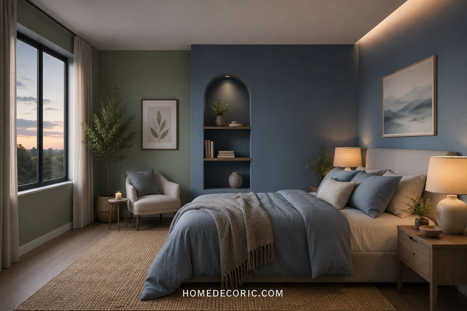
5. Charcoal and Deep Navy (For Cocoon Sleepers)
Dark bedrooms are not always a bad idea. For people who sleep best in an enclosed, cocoon-like environment, deep charcoal, navy, or slate walls create a dramatic calm. The key is keeping the rest of the room light, layered, and textural to avoid feeling oppressive.
Best shades to try:
- Charcoal grey (warm undertone preferred)
- Deep navy (timeless, bold, calming)
- Dark slate (blue-grey crossover)
- Forest green (deep and rich but earthy)
Why it works: Dark walls absorb light, creating a visual boundary that reduces environmental distractions. This works especially well for light sleepers or those sensitive to early morning light.
Pairs well with: Light bedding, brass or gold fixtures, soft area rugs, white or cream textiles in volume.
What Colors Should You Avoid in the Bedroom?
Bright Red
Red is the most stimulating color on the spectrum. It elevates heart rate, increases adrenaline response, and signals urgency. Full-red bedroom walls have been linked to difficulty falling asleep and shorter sleep cycles in chromotherapy research.
The exception: Very muted terracotta or dusty rose, used as a small accent rather than a dominant wall color, can work when paired with calming neutrals.
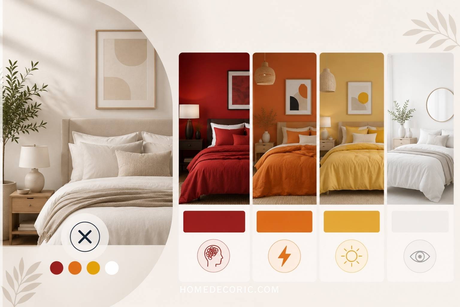
Bright Orange and Vivid Yellow
Saturated warm tones in the orange and yellow family stimulate rather than calm. They are energizing, which is right for a kitchen or gym, but counterproductive in a sleep space.
The exception: Warm honey or amber tones used in small doses, such as a lamp shade or throw pillow, can add warmth without overstimulating.
Stark Bright White
Pure white with cool blue undertones creates a clinical, sterile feeling. It reflects too much ambient light in the morning and lacks the visual warmth that promotes comfort. Warm white or cream is a different story and is actively restful.
High-Saturation Colors in General
Any color at full saturation increases visual stimulation. The same blue, when at low saturation, is peaceful; at high saturation, it becomes energizing.
When evaluating any bedroom color, check paint samples on your actual walls at multiple times of day, and always choose the lowest available saturation before committing.
How to Build a Complete Bedroom Color Palette
A bedroom palette covers every surface, textile, and finish in the room. Here is how to build a cohesive, sleep-optimized palette from start to finish.
Step 1: Choose Your Dominant Wall Color First
Your walls cover the most visual real estate. Start here. Pick one from the sleep-friendly categories above. Test paint samples on your actual walls and observe them in morning light, afternoon light, and evening lamp light before committing.
Rule: Your wall color should feel quiet. If it demands attention, it is too saturated.
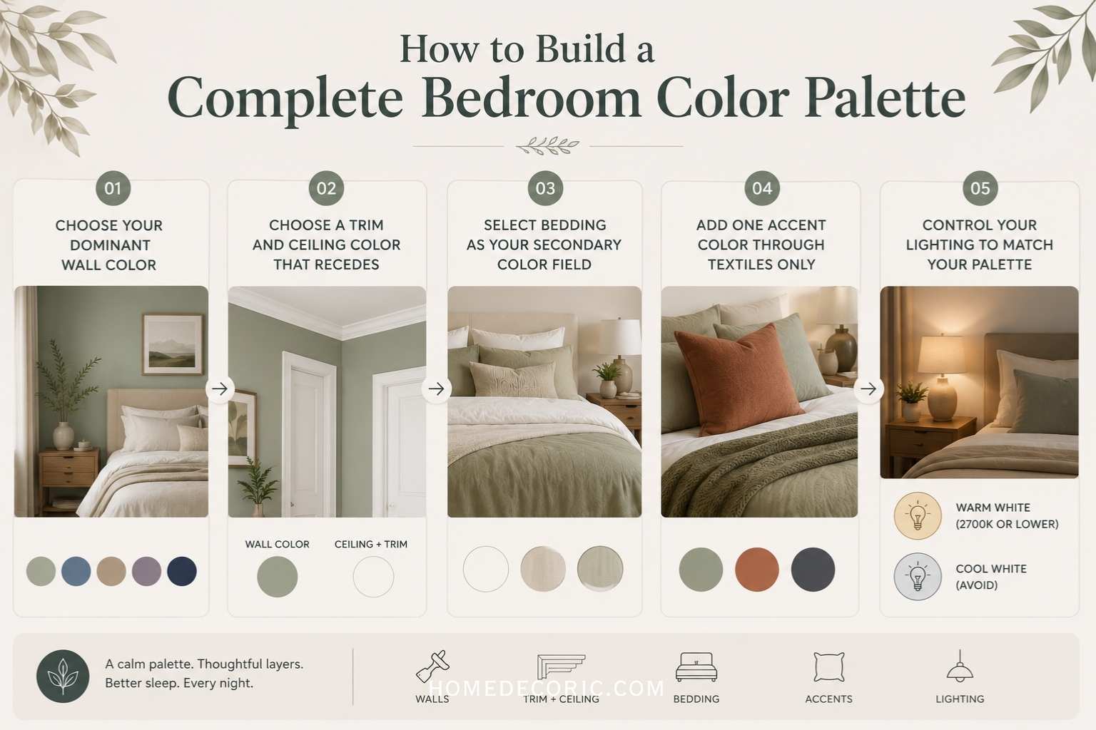
Step 2: Choose a Trim and Ceiling Color That Recedes
White trim works with almost any wall color. For a softer, more unified look, paint the ceiling a shade two tones lighter than the wall color. Avoid stark white ceilings with deeply saturated walls, as the contrast creates visual tension.
Step 3: Select Bedding as Your Secondary Color Field
Bedding is the second-largest color surface in the room. Crisp white, warm linen, or a tone-on-tone variation of your wall color are the safest choices for sleep. Avoid bold patterns or high-contrast combinations on a duvet or comforter set.
Step 4: Add One Accent Color Through Textiles Only
A single accent color used in throw pillows, a blanket, or curtain panels adds visual interest without disrupting the calm. This accent should be a deeper or more saturated version of a color already in the palette, not a contrasting complement.
Examples:
- Sage green walls + dusty terracotta throw pillows
- Soft blue walls + charcoal grey accent blanket
- Warm greige walls + muted olive accent cushions
Step 5: Control Your Lighting to Match Your Palette
Color looks completely different under different light temperatures. Cool white LED bulbs make every color look slightly clinical and stimulating. Warm amber bulbs (2700K or lower) make every color feel softer and more conducive to sleep.
Rule: Your bedroom lighting at night should always be warm white. Your palette will look better, and your sleep will improve.
How Lighting and Color Work Together for Sleep
Choosing the right paint color and then flooding the room with harsh overhead lighting undermines all the benefits. Sleep-optimized bedrooms use layered lighting:
- Ambient lighting: A ceiling fixture with a dimmer switch and warm bulbs
- Task lighting: Bedside lamps with 2700K or lower bulbs for reading
- No blue light: Avoid cool white or daylight bulbs after 7 pm
Dimming your warm-toned lights by 8 pm in a blue, green, or neutral bedroom creates a powerful signal to your body that night is approaching, and sleep is near.
Bedroom Color Palettes by Sleep Style
For Light Sleepers
Light sleepers need maximum visual calm and minimal stimulation. Best palettes:
- Dusty blue walls, warm white trim, grey-linen bedding, no accent color
- Soft sage walls, cream trim, white bedding, muted natural wood tones
For Anxiety-Prone Sleepers
People whose minds race at night benefit from enveloping, enclosed spaces. Best palettes:
- Warm greige walls, cream trim, ivory bedding, layered textures
- Deep charcoal walls, white bedding, brass lamp accents
For Couples With Different Sleep Preferences
When partners disagree on tone, neutral pivots work best:
- Warm taupe or greige walls satisfy both cool and warm preferences
- Use bedding color to layer in the cooler or warmer accent that the other person prefers
For Small Bedrooms
Small rooms benefit from lighter values to preserve the sense of space:
- Light sage, soft lavender, or pale greige all expand visual space while staying sleep-friendly
- Avoid dark walls in rooms under 120 square feet unless natural light is strong
For Bedrooms With Little Natural Light
Rooms with small windows or northern exposure need warmth to avoid feeling cold and cave-like:
- Warm greige, cream, or very muted terracotta work better than cool blues in low-light rooms
- Add warmth through lighting, not by increasing wall color saturation
FAQ’s
What is the single best color for a bedroom to improve sleep?
Soft, muted blue is the most consistently recommended color for sleep across research on sleep and interior design. It lowers perceived stress, creates a sense of openness, and is psychologically associated with calm. If blue does not suit your style, sage green or warm greige are strong second choices.
Does wall color really affect how well you sleep?
Yes. Environmental psychology research confirms that color influences autonomic nervous system activity, which controls heart rate, cortisol levels, and the body’s transition into sleep.
High-stimulation colors keep the nervous system in an alert state longer, while low-stimulation colors support the calm needed for sleep onset.
Can a dark bedroom color help with sleep?
For some people, yes. Deep navy, charcoal, or forest green walls create an enclosed environment that eliminates visual distractions and can help light sleepers or those sensitive to early-morning light. Balance dark walls with lighter textiles and warm lighting so the room does not feel oppressive.
How do I choose a color for a small bedroom?
Stick to lighter values of sleep-friendly colors. Soft sage, pale lavender, powder blue, and warm greige all maintain a sense of space while keeping the room calm. Avoid dark walls in small rooms with limited natural light.
Should the ceiling be a different color from the walls?
A ceiling painted two shades lighter than the wall color creates a visually unified, enveloping room. Stark white ceilings create a harsh contrast with deeply saturated walls. For maximum calm, tone the ceiling to a warm off-white or a very light version of your wall color.
What bedroom colors should I avoid if I have trouble falling asleep?
Avoid bright red, vivid orange, electric yellow, and any highly saturated color. Also, avoid stark cool white, which creates a clinical atmosphere that feels alerting.
Colors that are sleep-friendly in their muted forms, such as blue or green, become stimulating when used at full saturation.
Explore more bedroom guides on homedecoric.com, including how to choose the right bedroom lighting for sleep, the best bedroom furniture layouts for rest, and how to layer textures for a cozy bedroom aesthetic.